The Really Big Picture
 Headlines are scary. Markets shoot up on Monday then tumble on Tuesday. Weekly economic reports are all over the map. Pundits tell us the sky is falling, or is sure to fall sometime soon. Awash in a daily tsunami of confusing, confounding and contradictory news and sentiment, it can be hard for investors to keep their bearings. That’s when I turn to one very special piece of paper. Want one?
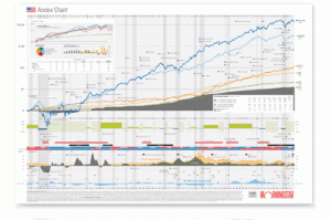
The Andex chart from MorningStar tracks the history of modern investing, including the performance of every major asset class since before the Great Depression. It’s the big picture I turn to (an oversized version is posted above my desk) to remind me that the overwhelming direction of capitalist markets is UP. Despite invasions, wars, recessions, natural disasters, bubbles, political conflicts, and the varied fortunes of specific companies, long-term diversified investors have been rewarded with phenomenal returns.
For instance, a dollar invested in small stocks in 1926 would have grown to $26,461 today.
I love the Andex chart and would be happy to share the love. Click here to request the latest Andex chart and I’ll send you a smaller version of the chart on my wall.
Max Osbon – mosbon@osboncapital.com
Weekly Articles by Osbon Capital Management:
"*" indicates required fields
