
Investing’s Greatest Graph
 This is one of the poignant stories told by the Andex chart. Produced annually by MorningStar, the Andex depicts the major asset classes over the last nine decades, plotting results in relation to interest rates, recessions, presidencies, savings rates, consumer prices, unemployment rates, tax rates, population and much more.
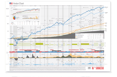
We consider Andex to be the most meaningful pictures in the financial world for demonstrating the inescapable upward direction of markets over time. It’s great, too, for condensing so much data in one place in a reader-friendly way. Yes, the graph shows downturns, including the Great Recession, but with its very long time horizon, the Andex chart clearly shows that the steady march upward in security prices.
Just as important, it shows the huge impact that asset class choices make. Over a lifetime, stocks typically return much more than cash or bonds. And riskier stocks, notably those of small companies, typically return much more than larger, less risky stocks. Getting the right allocation for you is so important. We welcome the opportunity to discuss yours anytime.
Own an Andex yourself
We’d love of you to have a copy of the Andex chart. It doesn’t scan well, so just send me an email with your postal mailing address and I’ll put it in the mail to you right away. It’s there for you to enjoy and absorb.
John Osbon- josbon@osboncapital.com
Weekly Articles by Osbon Capital Management:
"*" indicates required fields